Agro Sustentable: A New Identity and Somewhere to Put It

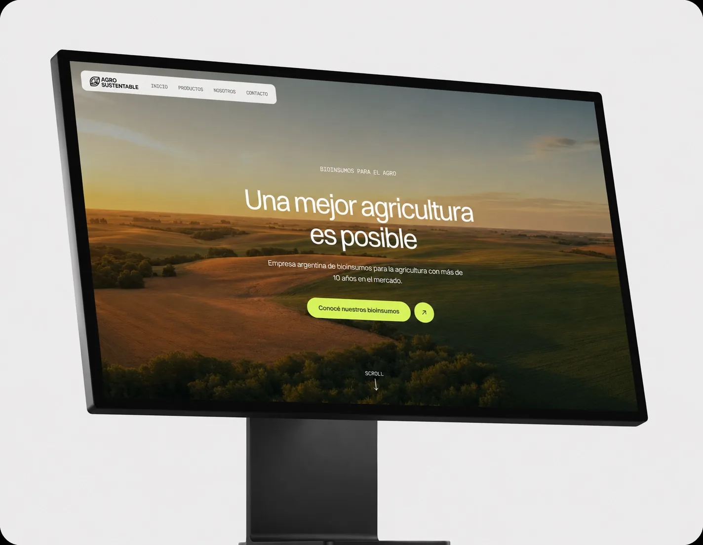
Agro Sustentable is an Argentine bio-inputs company with more than ten years in the market: fertilizers, biostimulants and pest control. I worked on two halves of the same shift: the motion piece that announced their rebrand, and the product site that gave the new identity a place to live.

Motion GraphicsWeb DesignWeb Development
Agro Sustentable: A New Identity and Somewhere to Put It

Announcing the Rebrand

  • Bridge the two logos: In After Effects I deconstructed the legacy mark and transitioned its elements into the new one, so the reveal read as an evolution rather than a break with an audience that already knew them.
  • Built for every screen: A 16:9 cut for presentations and web, and a 9:16 cut composed for Instagram and TikTok, with the reveal landing just as hard in both.
  • Organic pacing: Palette and timing aligned with what the company actually sells: sustainable agriculture, not tech.

The Product Site

  • A page per product: Each product gets its own page with specifications, generated from a single data source, so adding a product means adding data instead of redesigning a page.
  • Built for how it gets shared: Optimized images and correct link previews, because in this industry the site travels through WhatsApp.

Results

A rebrand that reached their audience in the formats they actually use, and a fast, lightweight site the client can extend without touching the design.

agrosustentable.vercel.appVisit the site